Project Series
Arts and Crafts Country House in Oxfordshire
Written by Jonathan Lees RIBA.
– a project memoir
‘……when designing the alterations to this Arts and Crafts country house, my main focus was on the creation of a picturesque, Lutyens inspired frontis that was joyful, playful, and most importantly, full of character. I also wanted to develop a design that was very much in the idiom of the Arts and Crafts – rather than a grand, opulent classically inspired frontage…..’
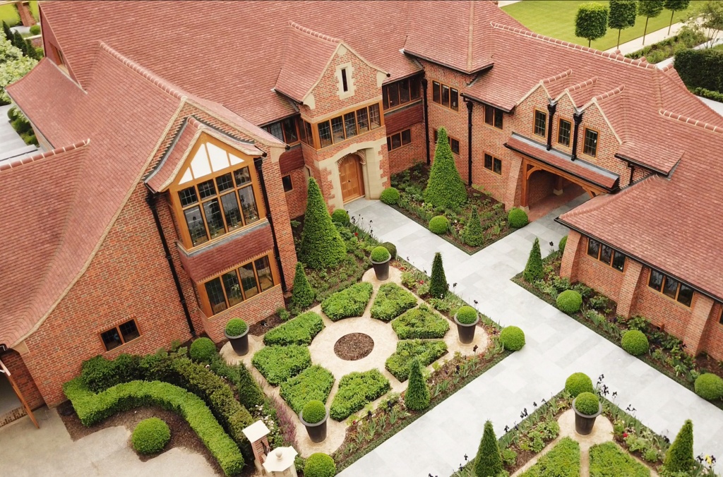
An aerial view of the completed house by Jonathan Lees Architects LLP 2019
This country house started as many projects nowadays do, with an email. The client had seen an image that I had painted of a modest, Lutyens inspired country house that had a simple vernacular language with classical features.
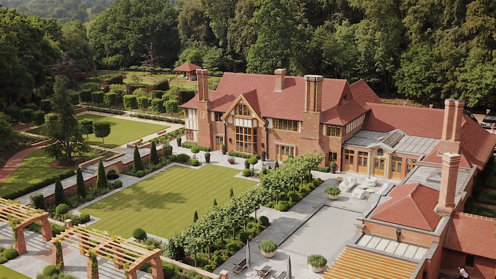
An aerial view of the completed house by Jonathan Lees Architects LLP 2019
‘…….. designed in the early 20th Century by Maberly Smith,
a contemporary of Lutyens.’
Part 1 – Inspiration from the existing house
A conversation first held on site revealed that the house was designed in the early 20th Century by Maberly Smith, a contemporary of Lutyens, with many features in the house resembling a crude, almost caricature version of Lutyens-esque detailing intermingled with some charming accents that were likely developed by the trades working on the site, rather than on the drawing board of the designer.
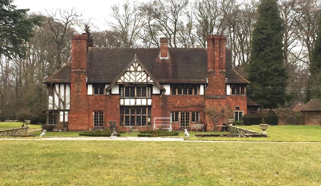
South Elevation – house photographed on first site visit
There was enough there to work with. The house Arts and Crafts style house had a beautiful oak framed gable to the south elevation, which had been butchered over the many years of redevelopment and alteration, but much still remained intact, revealing a charm that could not be ignored. The interior had been altered beyond recognition, with the once great, double storey hall being separated into a living room on the ground floor and a bedroom on the first, with an odd, pokey storage area to the vaulted ceiling in the roof space. There was a myriad of staircases, and the flow of the rooms created a rabbit warren of spaces that were easy to get lost in. Many of the windows were small and in the wrong locations, perhaps a hangover of a previous design or altered room layouts that occurred in the century since its construction.
‘…..a horror of Arts and Crafts, infused with a form of brutalism that was hard to place…..’
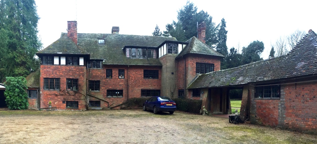
North Elevation – house photographed on first site visit
The north elevation was a horror of Arts and Crafts, infused with a form of brutalism that was hard to place other than to say that it was both austere, ugly and overbearing, with nothing to celebrate other than a charming little single storey wing where the main entrance of the house could be found. And it had to be found, it was by no means a simple building to navigate, despite its relatively small scale, set in the most enchanting beech woodland.
‘….the natural background of the woodland gave me inspiration that no building could.‘
The woodland was the first thing that struck me as I travelled up the rough track, flanked either side by tall, slender beech trees, densely packed into gently sloping banks. The beech trees were planted in an existing ancient woodland at the end of the 19th century, primarily for the joinery trade. The events of the first world war decimated the industry, and the woodland was left to grow of its own accord. The result is a mixture of native trees, with a vast swath of bluebells creating a sea of colour in mid spring, a time of year when it is special to be at this property. My early visits to the house were at this time, and the natural background of the woodland gave me inspiration that no building could. The influence of the woodland on the design and the features of the house would grow throughout the life of the project, and still continue to do so.
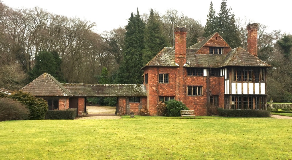
West Elevation – house photographed on first site visit
The small, single storey extension to the west wing of the north elevation was adjoined by a double garage, constructed of timber, plywood and corrugated sheeting. Next to the house on the east side was a rudimentary lean-to, with a barrelled roof set in between thick, dense conifers that towered over the house and blocked out all light. The setting was dreary, even on a sunny day, with a sense of macabre. The architecture sucked the will out of anyone who looked upon it, and I wondered at first, what could be done to tame this beast.
‘About the only good thing that I could see was the materials that were used.’
About the only good thing that I could see was the materials that were used. The bricks on the main walls were those from the local brick manufacturers at HG Mathews, as were the oak Fired, hand-made variety that is still in production today. This gave me immediate hope, as although the brickwork was in poor condition due to many years of neglect, I knew that we could match the character of the existing south elevation with any alterations that we carried out. The roof tiles were a charming clay tile, with sprocketed eaves, a favourite and often go-to detail for the creation of picturesque and sweeping roofs that were ever so present in the Arts and Crafts houses of the time. The windows were oak framed with metal inserts, creating a vernacular aesthetic that worked well with the accents of the plastered panels between the oak frame members. The complete saturation of the oak by decades of creosoting meant that the heavy blackness of the frames was half-way between mock Tudor Revival and a simpler, vernacular character that could be found in the surrounding region. Years of neglect had seen most of the materials fade into disrepair, with the occasional clean area of original masonry being bordered by a bodged repair of sand and cement.
‘It was at that time, a modest approach to refurbishment and extension. That was soon to change.‘
With the scene set, the brief, at that stage, was to beautify the North entrance elevation, design a garage wing to replace the lean to and conifers, and to carry out some modest changes to the interior. All in all, it was at that time, a modest approach to refurbishment and extension. That was soon to change.
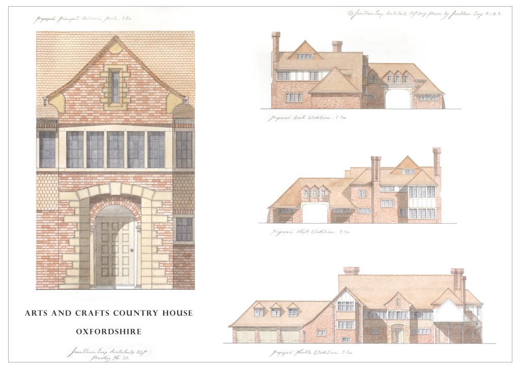
Country House Oxfordshire – Sketch Scheme Design in Watercolour
‘See what you come up with…...‘
Part 2 – Designing and remodelling the house
As with all of our projects, we started with a survey of the existing house that I carried out with my team, along with a more robust measured survey carried out by our surveyors. I wanted to get the best possible understanding of the structure and spending a couple of days on site carrying out our own measurements helped us to develop the beginnings of a new layout that would revitalise the house.
The client wanted us to be ambitious but gave us very little to work with in terms of requirements. The brief was quite simple – ‘see what you come up with’.
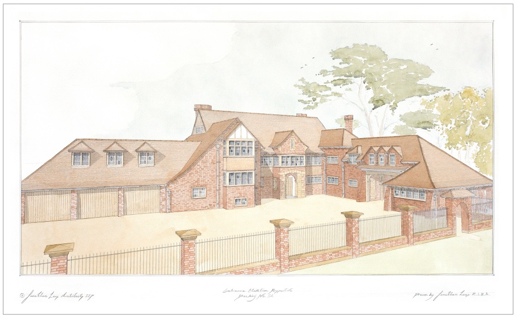
Country House Oxfordshire – Perspective in Watercolour
I cannot fully recall what I started with, but my main focus was on the creation of a picturesque, Lutyens inspired frontis that was joyful, playful, and most importantly, full of character. I also wanted to develop a design that was very much in the idiom of the Arts and Crafts – rather than a grand, opulent classically inspired frontage, I wanted to create a soft, inviting, warm home, that welcomed people in through the doors rather than an overbearing, austere frontage that demanded attention from afar. The edge of the woodland was meters away, and any frontage could not compete with the overhanging, leaf laden boughs of the oak and beech trees. The scale of the trees was impressive and also overwhelming to the house, with the light from the south hitting the woodland edge and creating a depth in the canopy and woodland floor that seemed to go on and on. It reminded me of enchanted forests from the stories that we are all so used to reading.
With the entrance elevation we had a challenge, as it faced directly north, and was flanked on the east by tall trees that the morning sun could not penetrate. To the existing north elevation of the house was a brick built lift shaft on the north west corner of the entrance elevation that was truly the most hideous addition you could possibly see on a house of this nature, and this created its own shadow of foreboding on the ground that sapped the very last drop of happiness from the viewers soul.
‘The house felt to me like it had a soul, a story to tell…...‘
The easy route would have been to suggest to the client that there was only a handful of things to save and that we should call in the bulldozers to help preserve the health and wellbeing of future visitors. But that did not seem right. The house felt to me like it had a soul, a story to tell. As an Architect, I am often laughed at, including by my own family, for suggesting that buildings not only create a sense of space, but they have a sense of their own. It is not to say that new buildings do not have a soul, the ones that are designed properly do, and these are young souls. But this building felt like it had an interesting story to tell and had seen many seasons. It had clearly been attacked by Dr Frankenstein and his followers over the years, but there was enough of the house left to shine through.
So, we set about determining what was good, and should stay, and what was a travesty, and should go. The south wing, with its beautiful bay window, the west wing with its handsome, double storey oak frame and the volume of the core of the building, the heart of the structure, would stay. The rest, the augmentations of later generations, would go.
‘this design was immediately going off on a tangent that was heading in a picturesque, classically infused direction…..’
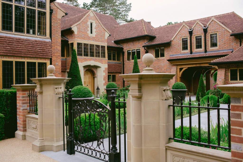
Completed North Entrance Elevation and Courtyard
Part 3 – An Arts and Crafts inspired entrance elevation
The challenge of the entrance elevation was to make it welcoming. Inspiration came from the likes of Lutyens’ Little Thakeham, Fullbrook and Tigbourne Court along with Baillie Scott, CFA Voysey, Phillip Webb and Norman Shaw. Each have influenced my work in various ways, as have many of the earlier Palladian and Neo-Classical architects of the 17th, 18th and 19th Centuries. However, this design was immediately going off on a tangent that was heading in a picturesque, classically infused direction that would balance a vernacular language with material quality and subtle, classical detailing to gently enhance features.
‘I knew that the material palette would sing on its own.’
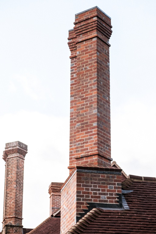
Handmade brick stacks modelled from the originals
I knew that the material palette would sing on its own. Hand-made bricks laid in a buff lime mortar, with their irregular shape, coke stains from the firing, pockets and folds, there could not be a better brick to use. I quickly decided that the aggregate in the mortar should be coarse, and most importantly be flush brushed with the face of the brick so that the texture of the brick was complemented by the colour and specs of flint and sand that broke through the mortar, creating a dappled lively character to the walls that makes them feel alive. The colour variation in the brick would enable us to create large, plain areas of wall that would otherwise feel austere and perhaps overbearing, but in this material, with this mortar, these walls popped out and became features in themselves without the need to adorn them with any feature or afterthought.
Oiled oak became the next material of choice. After long discussions and debates with the client over whether the material should be kiln-dried oak or green oak, it was decided that kiln-dried joinery-quality oak should be used for all windows, doors and framework. This was a decision that would greatly affect the development of the building and ultimately created award winning joinery.
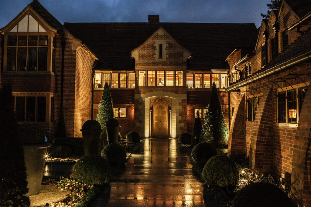
North Entrance Elevation and Courtyard
The Tudor clay tiles on the roof were a must, but I wanted to make more of it as a feature. The roof on the house was huge in comparison to the elevations. The voids in the roof of the existing house were practically another house on top of the main building, and it quickly became apparent that we would be utilising the space in our designs. I had in mind the great sweeping roofs of Lutyens’ Folly Farm, Woolverstone House and Sullingstead, where great expanses of roofs culminate in gently sprocketed eaves that project far past the line of the walls, creating an overhang that casts a shadow on the textured bricks below and makes them dance in the dappled light. I also decided that the eaves should become a principal feature of the house, given that they were the boundary between the two most prominent materials, the closely matched red clay brick and tiles. I was conscious that a soft boundary should break the colour but without creating a hard stop. I also wanted the sprockets that created the shallower, 32.5 degree pitch of the eaves to project out from the wall in the form of oak rafter ends with a cyma moulding to the bottom, a common theme in our designs. Oak sarking boards over this created the subtle, translucent detail that I wanted, allowing the guttering, with their delicate swept brackets to crown the tops of the walls and frame windows without the need for any adornment in stone or carved work.
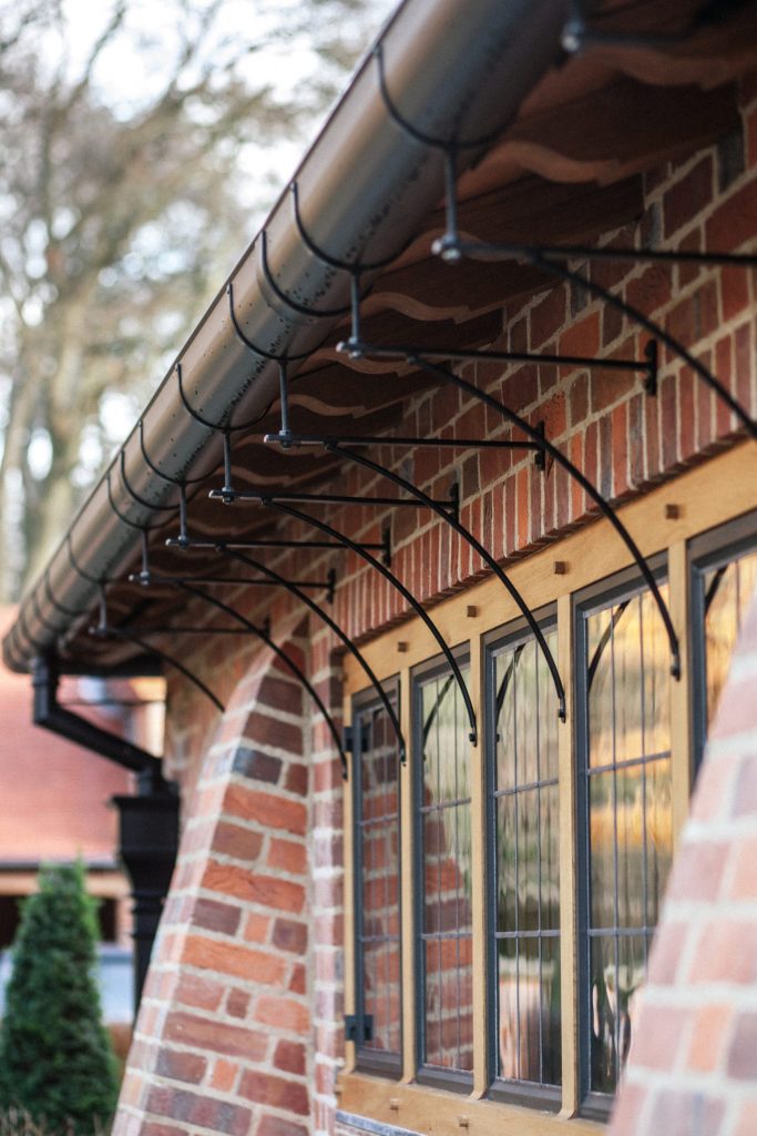
Swept brackets under the eaves
‘The structure needed balance and gravitas, together with features that helped to accentuate the scale of the various extensions….’
With the detail of the transition of the walls and roof in mind, I wanted to create a dynamic entrance that punched forward of the main wall of the house, together with an extension to the single storey wing that would create a modest but inviting courtyard at the front of the property. There was enough room between the house and the edge of the woodland to create a garden that could serve as a formal entrance to the main house. Whilst the garage wing increased the length of the building, I was conscious that this was single storey and was the first building on approach from the drive. The structure needed balance and gravitas, together with features that helped to accentuate the scale of the various extensions that I was proposing.
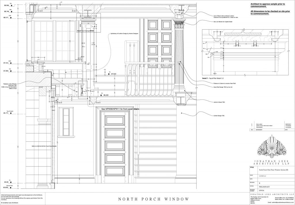
Section through North Porch and Gallery behind
The central frontis, which forms the main entrance, is flanked either side by symmetrical bays that include full width gallery windows at first floor, wrapping around the central frontis and tripartite oak casement windows below, set in the centre of the space. The gallery windows are the main feature and are able to be full width without the risk of causing overheating as it is the north elevation. The diffused light that enters the gallery from these windows creates a soft, natural light that complements the often dazzling light through the south bay window.
The gallery is taken through the frontis, flowing around the walls to create a ribbon of light in the internal space, Main Hall and stairwell behind. The oak structure of the windows, with their sturdy corner posts, provides a delicate strength that frames the slender, beautiful bronze casement windows. The window over the frontis is embellished with a reverse cambered beam, with the sloped face being infilled with creasing tiles to create a simple texture that complements the brick and surrounding masonry.
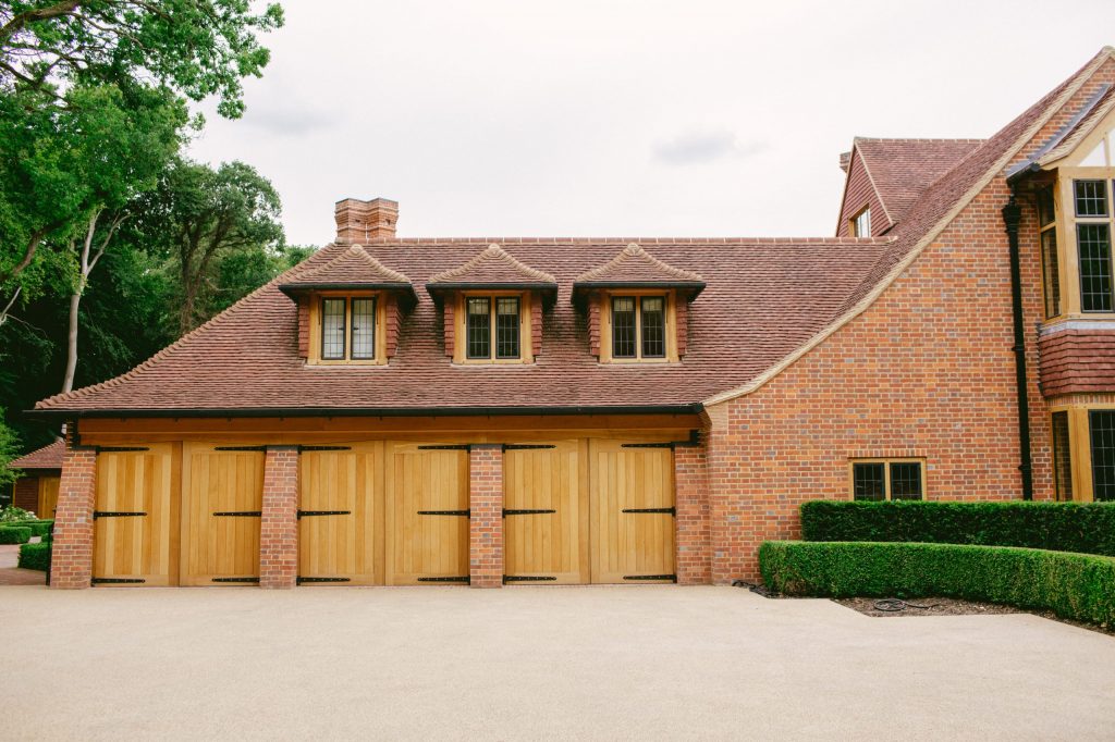
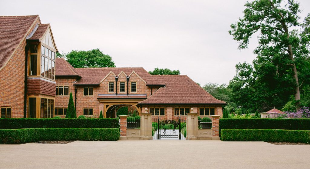
Single storey North wing and East garage wing
Part 4 – The Oak-framed garage wing
The garage wing is of a simple design to reflect a subserviency to the main house and to ensure that it does not dominate over the main structure. The eaves are low, with low slung cambered oak beams forming the three openings spanning between curved buttresses. The doors are ledged, braced and framed, with flush boarding to the outside set on large, thick iron hook and band hinges that we designed for the purpose. Above the oak beams, exposed sprockets and sarking boards with the custom guttering and brackets create a dominant eaves, ensuring that the focus of the structure is on the roof, interspersed by its three, quaint, picturesque dormers that sit symmetrically over the garage door openings below. The dormers are clad with vertically hung tiles to the cheeks, with inset oak frames and bronze casement windows and a hipped roof over, framed by an oversized gutter that balances the main roof and eaves. This connects to the existing house by hipping into the projecting east wing, which creates a cinema room at ground floor and the ornate, vaulted space of the family bathroom over. The projecting east wing also includes the playroom behind the new arrangement of the kitchen, with a small window to the north elevation. In order to balance the longer projection of the west wing, which was to form the coach house and gym, I wanted a feature that would frame the central entrance but not compete with the hierarchy of the design.
Part 5 – The front door
‘The stone is the prominent feature but even this is subtle.’
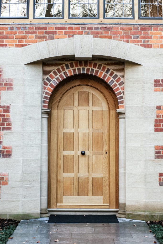
The Front Door
The sandstone we chose for the project was from the North of England and it was one of two stones that we used dependent on the level of detail in the carving, due to the tightness and density of the stone. Both stones were tightly bound, smooth to the touch when dressed and had a lovely fleck of brown that set it apart from being accused of being artificial stone. Rather than rely on just the smooth texture of dressed ashlar, I wanted the stone to complement the vibrant and tactile quality of the brickwork. I also wanted the details that we were putting into the feature to pop out and in order to do this, we created a tooled margin to the perimeter of each of the quoin stones with a scabbled, or sparrow-pecked field to the centre. The tooled margin sets the stone off from its neighbours and from the mortar joints, bringing attention to each piece. This gives absolutely no room for error, but creates a beautiful, rough, but even texture that dances in the sun and dapples in the wet, adding another layer of detail that gives life to the wall.
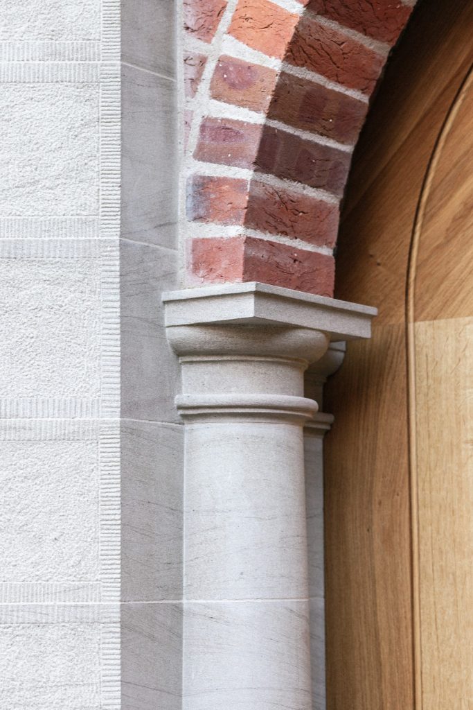
Front Door Material Details
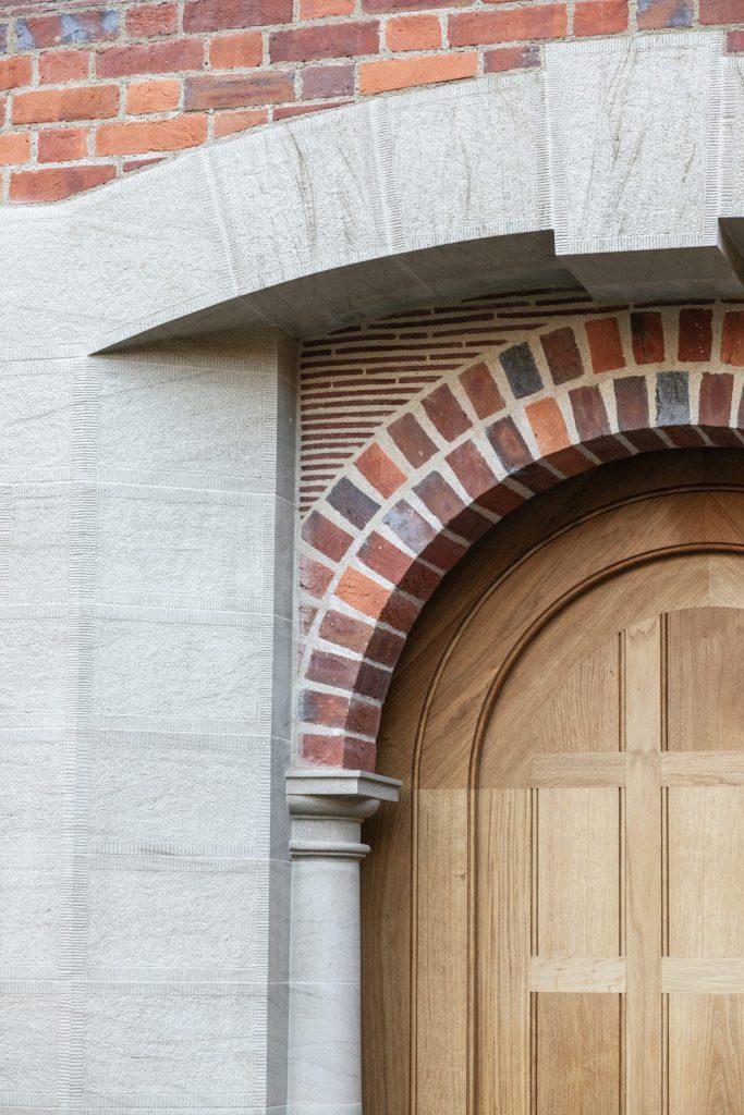
The tooling of the face work means that the pair of Doric columns that frame the entrance door are highlighted in the most subtle way possible but without the need to either change the material or provide unnecessary detail or carvings. The inset brick double header arch that springs from the columns supports an infill panel of creasing tiles which, when built traditionally, as it is here, is a work of art itself. This in turn supports an oversailing segmental arch formed in the tooled stone, with the corner stones extending to form the top quoins and expressing the corners and to terminate the stone detailing below the gallery window. Above this, an arrow slot window with stone surround picks up the detail from the door surround and pulls the two parts together. The brickwork interlaces with the staggered quoins and coursing-in perfectly with a pair of kneeler stones and an apex stone that crowns the top of the ensemble. Creasing tiles are then used to form the verge of the sloping roof, with doubled up verge tiles and mortar pugging pulling the design together with the soft, ochre colour of the buff sand to knit together the individual parts.
Part 6 – An artfully altered roofscape
Although the Coach house provided an opportunity to create a frontage to the house to welcome guests travelling down the entrance road, the house was still missing something, a link that galvanised the new East garage wing to the existing mass of the main house. Rather than butting the roof of the garage into the side wall of the projecting bay to the east wing of the north elevation, I wanted to create a long, gentle slope that allowed the eye to flow up from the ground, to the very top of the roof, enhancing and emphasising the scale and form of the existing roof structure, which we had largely retained. By applying some simple creativity to the levels, we were able to create an elegant valley between the long, extended sloping roof of the east wing which intersects the roof of the garage wing with a swept, fully tiled valley. This skilful piece of craft is in itself a testament to the quality, patience and skill of the roofer, as it enhances the curvature of the roofs beautifully as it sweeps down from the hogs back ridge tiles to the shallow slope of the sprockets. The end of the slope is supported by a corbel created using creasing tiles to complement the surrounding brickwork, the same detail as used at the eaves of the projecting east wing, allowing the stone kneelers on the central frontis to be more prominent.
‘This skilful piece of craft is in itself a testament to the quality, patience and skill of the roofer……’
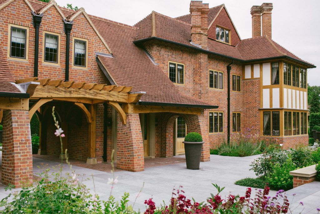
West Garden Elevation
‘I wanted to do something more spectacular on the West elevation of the house…..’
Part 7 – The West wing
The next task was to create the west wing and to understand how this should be linked to the corner of the existing house without it looking like an obvious tack on. I wanted to do something more spectacular on the west elevation of the house, as we had already started to develop our plans for the gardens and had an understanding that there would be a feature garden on the central axis of the wing, eventually leading to a Tennis Court.
We also had to deal with the arrangement of the rooms inside this wing, which wasn’t as simple as first seemed as we did not have the width in the building to provide a corridor to link the individual rooms. Although I wanted to create something unusual on the west elevation, I was conscious that the design of the rear of this wing should not compete with the frontis. As this wing is the first structure visible on approach from the driveway, it needed to provide character and interest without appearing so grand that it cramped the courtyard. Rather than create a ground floor room that linked the library and main house to the gym, which was to occupy the end of the west wing, now referred to as the Coach House, I settled that this should be accessed from the first floor and through a separate external door to a cartway, constructed in oak, and provide a link on the axis line that had been created through the courtyard to the west gardens.
‘This caraway is flanked by defiant, robust, curved brick buttresses……’
This cartway is flanked by defiant, robust, curved brick buttresses that support a large solid oak cambered beam. This beam is crowned by a massive cornicione – a giant section of oak with a single pitch roof of its own that passed back into the structure and is framed by immaculate lead work dressed seamlessly into the brick coursing.
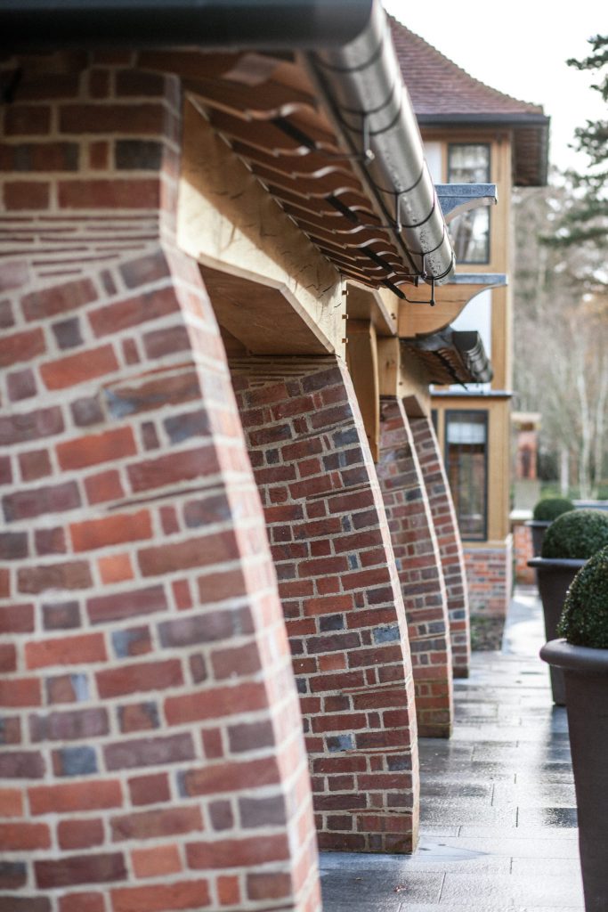
The Curved Brick Buttresses
‘The brick buttresses were one such detail where the skill of the trades were pushed beyond the ordinary.’
‘…..I say to those people that they just need to challenge our resilient, talented and highly skilled craftsmen…..’
For those that intimate or say to you that there are no longer the trades out there to carry out such flawless craft, I say to those people that they just need to challenge our resilient, talented and highly skilled craftsmen to produce something that although may be difficult, will yield results that we will forever be proud of. The talent is there, it just needs to be encouraged out of comfort zones. Most craftsmen we have coaxed beyond the mundane have loved, and feel an immense pride in, the work they have carried out for us.
Part 8 – Award winning brickwork
The brick buttresses were one such detail where the skill of the trades were pushed beyond the ordinary. I did not want to use cut bricks, as it would be too easy. I did not want to use gauged brickwork, where the bricks were cut in the factory and arranged like a 3D jigsaw on site, that was not in the spirit of the design. I wanted the original bricks to be used in such a way that the quality of the material was also expressed in the skill of the laying. Creating a curved surface out of rectangular block is trickier than it sounds, and conveying how you want a bricklayer to lay the bricks with decreasing mortar fillets and creasing tile springers to infill gaps is just as challenging. It is not something that can be drawn – every attempt leaves an ugly, irregular arrangement that neither looks correct or attractive. So the answer was to work it out on site and to persevere with attempt after attempt until the perfect balance was reached. I lost track of the number of buttresses that were built up and taken down again, but we did eventually get there.
‘….one of the features that helped the project to deservedly win the Craftsmanship award at the Brick Awards 2019.’
They are probably the simplest and most distinctive of all of the features or details in the ensemble and are a recurring theme throughout the design. They are used to break up otherwise plain sections of wall, to provide additional structure and interest in the form of the large buttresses to the open loggia of the west wing. They are also one of the features that helped the project to deservedly win the Craftsmanship award at the Brick Awards in 2019.
The large buttresses to the cartway on the west elevation of the Coach House frame the oak superstructure that creates the opening through the building. Formed using thick oak posts with beams over and detailing reflecting the skilled craft used to joint the members.
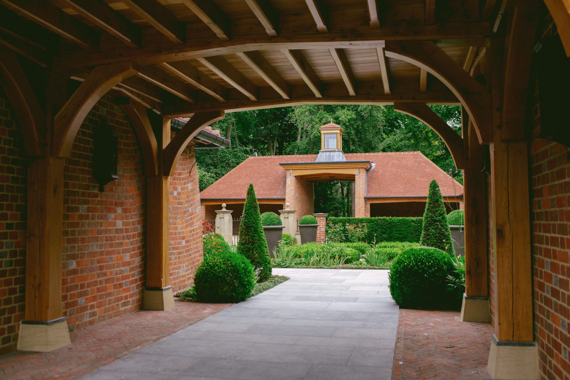
The Coach House Cartway through to the Gatehouse
The courtyard elevation, with the dominant cornicione over the archway is embellished only with an arrangement of three windows with a saw-tooth roof over each, creating small valleys and drainage shutes leading to hoppers between the roof sets that dispel water onto the tiled roof of the cornicione. The long, sweeping hips of the gymnasium roof create the final descent of the slopes from the main house, which is staged in three layers to drop from the main roof itself, down to the two storey wing of the Coach House and finally down to the single storey roof of the gymnasium which projects beyond the cartway to frame the courtyard.
Part 9 – The Gymnasium
The Gymnasium has three sets of tripartite oak windows set between small, shallow buttresses to the east elevation. These are crowned by an oversailing eaves of the same arrangement as the main house, with projecting oak sprockets and cyma mouldings to the end carrying a large, deep set gutter supported by delicate brackets fixed to the brickwork and to the frames, with a bracket for each jamb and mullion, setting up a rhythm of curved braces that dance across the elevation in the rising morning sun.
The gymnasium was a trickier structure to build than it looks as, unlike the rest of the building, the roof has a steel frame to enable the space within to be a single void without a ceiling. This allows access to the room from over the cartway, where an elaborate steel staircase provides access from the first floor yoga studio. The staircase is one of our hidden details, concealed in a room which is dimly lit, the amount of detail that we designed into the metal panels, treads and risers was skillfully executed by the manufacturers and is one of the more unique features in the house.
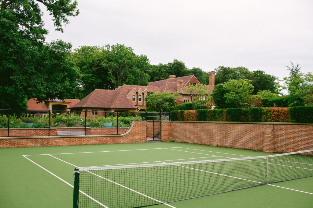
Towards the Gym from the Tennis Courts
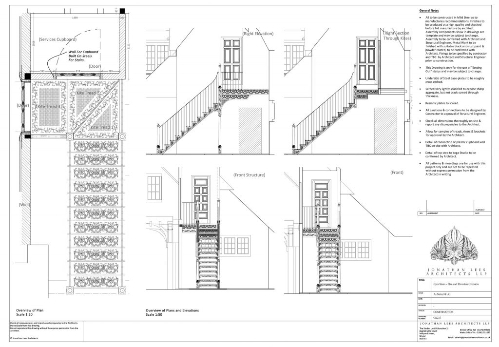
CAD Drawing of the Gym Staircase
‘…..one of the more unique features in the house.’
See more pictures of the staircase here in the Curiosities Emporium.
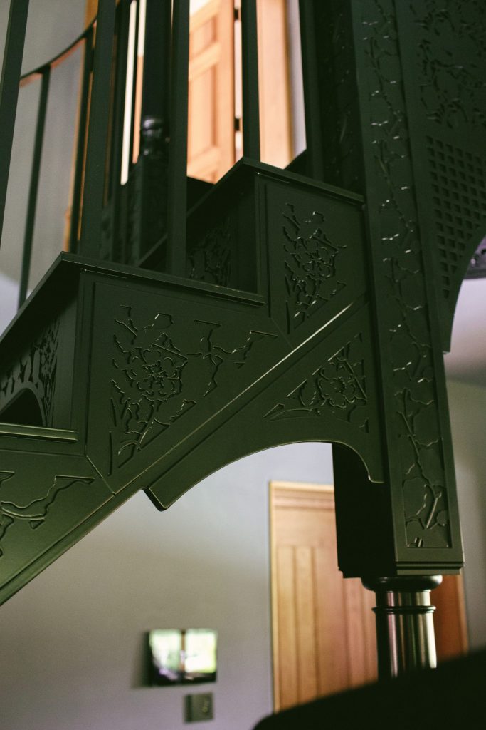
A Detail of the Gym Staircase
Part 10 – The Dramatic West Elevation
The west elevation of the wing is far more playful. The design is not constrained by the surrounding house nor has any risk that it will overshadow the extensive gardens. The beautiful existing oak frame of the west bay was reconstructed and re-designed using engineered oak sections. We designed all of the moulding profiles to work seamlessly inside and out, whilst ensuring that the panels were insulated with breathable, sustainable insulation that would receive lime render on top.
‘The beautiful existing oak frame of the West bay was reconstructed and re-designed.’
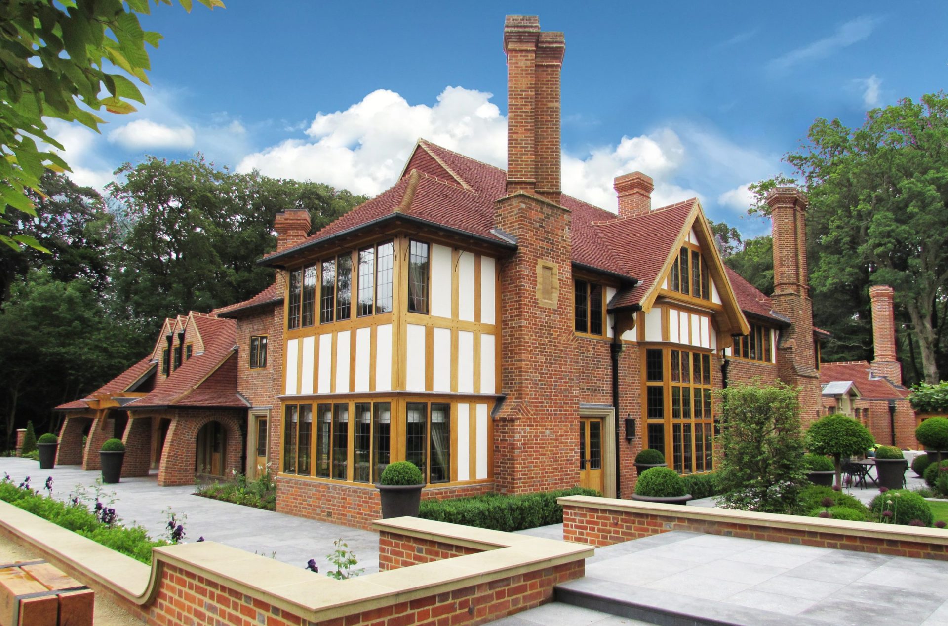
The West and South Elevations
The projecting west wing was remodelled with the fenestration altered to reflect a more symmetrical arrangement working around the charming chimney stack that was restored and largely rebuilt using bricks from elsewhere in the house where they had been removed. The transition from the two-storey structure of the original wing, to the extension of the Coach House is more dramatic, with long sweeping roofs breaking the eaves lines and sweeping over the walls to be carried by massive green oak beams supported on equally strong brick buttresses below. The buttresses, in this instance, are free standing, with a half round arch linking them back to the Coach House with strong, triple header brick arches that provide a sense of solidity and eternal fortitude. The vaulted roofs, created by the sweeping slopes, constructed with oak rafters and sarking boards, provides a place to enjoy the evening setting sun in quiet serenity.
Part 11 – The South facing garden elevation
The south elevation of the house included the south bay window and two chimney stacks, with surrounding brickwork, that we wanted to retain. The south bay framework was decrepit and has suffered greatly at the hands of the DIYers, being plastered in noxious creosote and butchered almost beyond recognition with plywood and softwood repairs. However, I wanted to retain the character and architecture of the window as a testament to the history of the building, and because it was in itself a handsome thing.
What was once the main hall, with its Oak beamed double storey space and minstrels gallery, had been replaced by inserting a floor at first floor level to create a new bedroom and oddly shaped storage space above. The resulting impact on the south bay window was unfortunate, as the original windows were infilled.
‘Our redesign proposed to return the main hall, or drawing room, back to its original glory.’
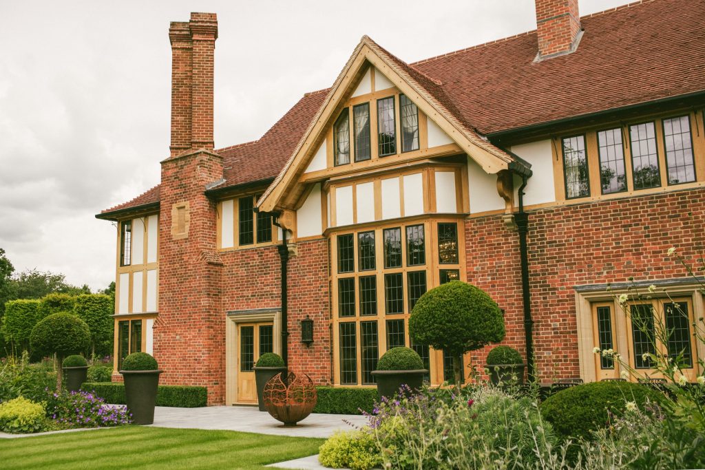
The South Elevation
Part 12 – The Orangery extension
At this time, the summerhouse wing was merely an apple in our eyes. We had not yet considered or fathomed its creation. So the east wing was originally designed to be a single storey extension off the existing kitchen, which was quite small for the size of the house, and to have the garages on its northern face with a utility and boot room forming the service entrance to the property. In order to provide vertical balance, a tall chimney was included on the far eastern end of the extension in order to provide the diminishing scale of the structure with a termination that links back to the vertical scale of the existing house. The roof of the garage structure was set back, enabling the kitchen extension to be a single storey, flat roofed structure, and ensuring that the elegant oak framework of the existing east elevation of the house remains visible.
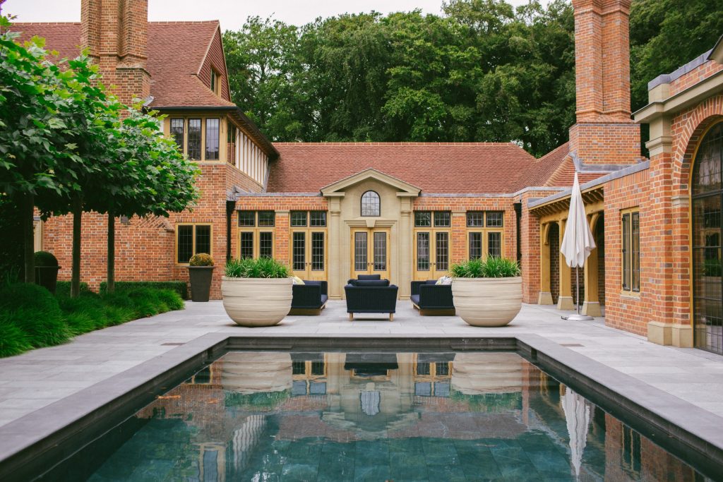
The Orangery Extension
‘Little did I know that this would be the start of a cascade of detail…..’
I wanted to create an orangery, rather than a formal brick extension. The south facing elevation was too obvious a target to ignore and I wanted to spice up the architecture by introducing more classical detailing that was hinted at by the Doric columns in the main entrance. Little did I know that this would be the start of a cascade of detail that took the classical influence of the design through the orders of architecture that we are still developing to this day.
The central frontis of the orangery is a statement that balances the south bay window, despite it being significantly smaller in scale. Although I wanted to introduce a more formal, classically inspired language, I was convinced that this should be playful and still somewhat modest in character. As with the porch to the north elevation, the quality of the stone is embellished with tooling to the margins of each stone, with a scabbled field in order to enhance the texture of the stone. A deep bolection mould to the door surround, and a thick, projecting keystone creates shadows that enhance the central door feature and dances across the stonework. The door is framed by a pair of Doric columns that are half engaged into the stone, supporting a broken pediment over which omits the central section of corona to create an open tympanum. A deep, sloping reveal sweeps back to form an arched headed window with bronze casement insert that is crowned by the oversailing raked pediment and springs from the entablature either side of the opening. This feature provided a new line of axis to the gardens that eventually led to, and dictated, the architecture of the summerhouse and culminated in the Belvedere at the southern end of the garden on the axis line of the orangery frontis. These buildings are explored and explained in detail in separate writings.
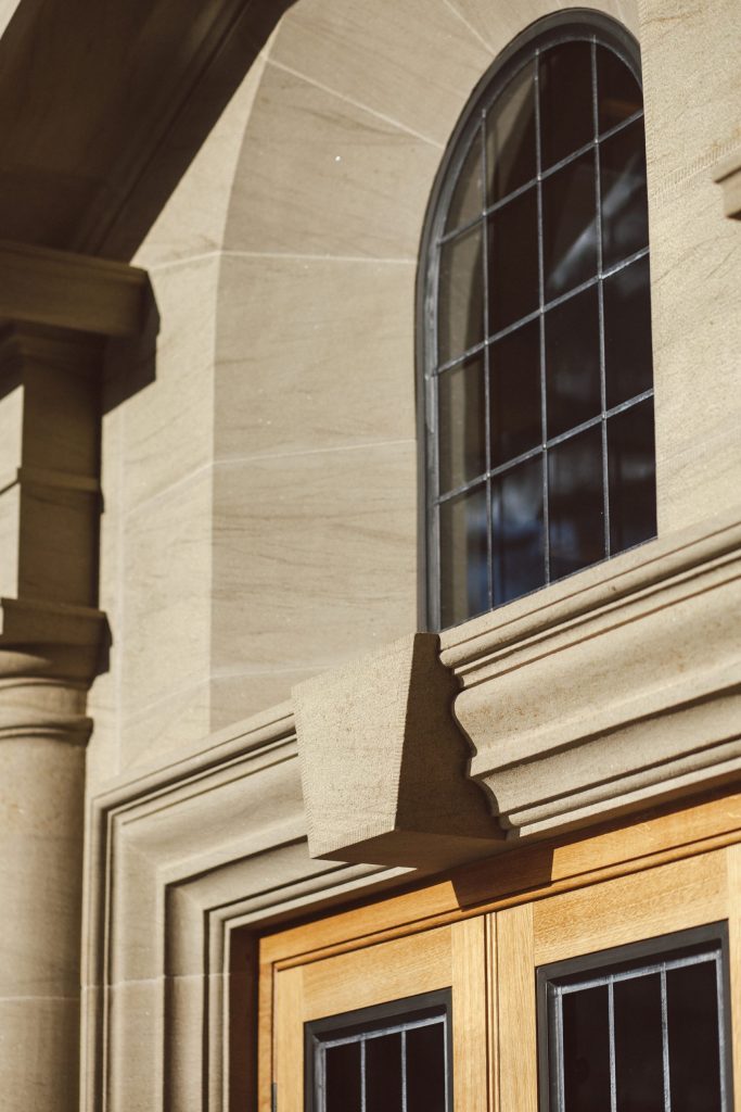
Details on outdoor brick fireplace – J Lees Architects
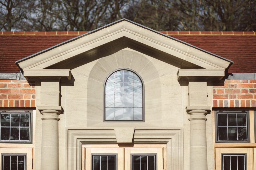
Oak garden loggia rafters – J Lees Architects
‘To allow the fronts to shine, it was important not to crowd it with too much detail.’
To allow the frontis to shine, it was important not to crowd it with too much detail. The door frames either side are relatively narrow double doors, with fanlights separated by an oak transome and mullion rather than stone detailing. Inset gunstock stile doors with bronze casement inserts sit flush to the frames, which are separated by brick piers and simple squared bases, stone thresholds and square pilaster capitals that support a flat header arch of brickwork passing over each side of the orangery. A simple Code 5 leadwork capping adorns the top of the parapet wall and conceals an elegant and beautifully made lead roof behind, with an array of box gutters and flashing details to dispel into two downpipes sitting at either end of the structure.
The orangery represented an opportunity to create a significant increase in floor space, without dominating the exterior by over-indulging the architect’s desire to build as big as we can. Rather make the building look huge, I wanted to do the opposite, to create something that provided additional space without overpowering the existing structure, whilst creating a link to the architectural language that we were beginning to develop across the site. That itch would not be finally scratched until the summerhouse was designed after the building work had commenced.
‘….my studio team alone have produced in the region of 1500-2000 drawings for this project….’
Part 13 – Designing the interior layout
With the exterior of the house designed, and the necessary permissions secured, it was time to start our detailed development of the interiors and the process of the working drawings. The tale of the construction of the house, and the hundreds of skilled trades and professionals involved is perhaps a story for another time but suffice to say that my studio team alone have produced in the region of 1500-2000 drawings for this project, ranging from full sets of working drawings for the wings, to pencil sketches of the details.
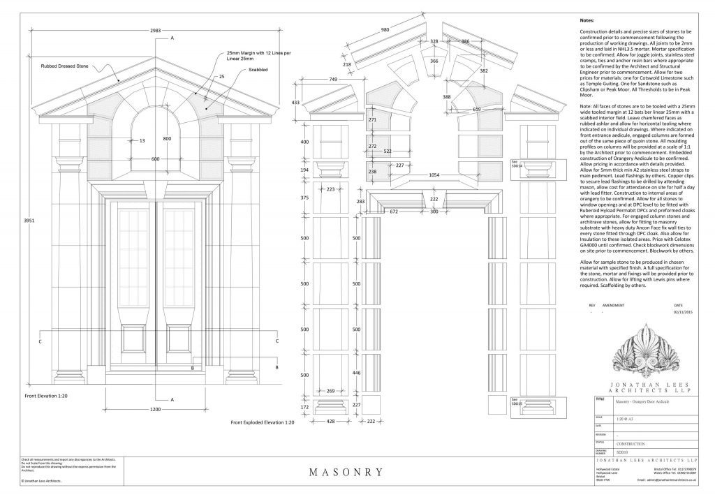
Detail drawing of the orangery frontis masonry
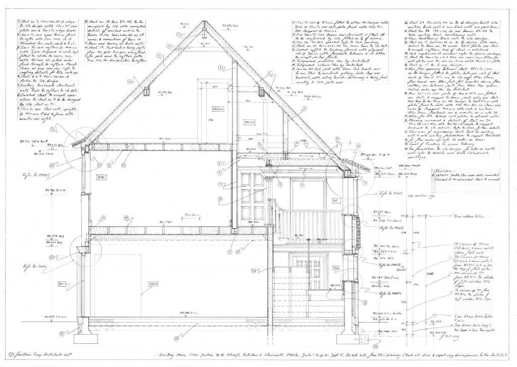
Section drawing through the main house
The design of the Summerhouse, Gatehouse, Stables, Belvedere and Woodland Barn all occurred during the construction phase of the project and were additional to our original concepts, so I will write about those separately. At the time, my team and I had our hands full with the main house.
The interior of the house was a challenge. The rabbit warren of rooms created odd, dingy areas with little or no light and ceiling heights were an issue. Some rooms were too small, some too big, and some, in the completely wrong area of the house. The layout was a sign of the times, where the kitchen and scullery were part of the service wing. The issue is that the house was not really big enough to warrant a service wing in its then existing form, so the rooms in the main house were struggling to cope with their uses. The dining room was too small, the main hall too large, the entrance was a pinch and brought you in through the side of the house into a narrow, dimly lit hall. It was all a bit of mess. The service wing was clad almost entirely with white tiles, so that it looked like a ward out of Arkham Asylum. Doorways were narrow, details were bland and unimaginative, and the only discerning feature, being the minstrels gallery, had long since vanished.
It was somewhat depressing, with both staircases being pokey, winding, boring features with little creative charm. There was nothing to celebrate, and nothing to keep. So we set about our redesign with ambition and gusto, to create something that we felt was a testament to the site. The rooms were not huge, but that did not mean that we couldn’t stretch our imaginations and push the boundaries of our creative skills.
I cannot fully remember how we started. However, we normally start by creating a 3D model of the existing house so that we can understand the structure of the building. But this situation was different, as we were altering so much of the original structure that the normal rules of engagement did not really apply. It was kind of like starting with a space that resembled the stairwell at Hogwarts, where the stairs constantly moved.
Part 14 – The working wing
The entrance porch to the north elevation was purely for guests, as it has been decided that the daily entrance to the house would be through the bootroom on the east elevation, which was linked to the garages, WC and kitchen, as the new hub of the house. The bootroom was embellished with beautifully designed and made cabinetry from Doig Furniture. Duncan Doig and his team produced units of such quality that complement the time and effort that my team and our joiners had put into the building and I was more than happy to have him help us on the project by developing this room, the stunning kitchen units and the units to the dressing rooms.
Part 15 – Bespoke contextual designs
There are a lot of elements in this house that we designed that deserve their own writing. All of which are based on the same thematic response to the site. As with many of our projects, we were given the opportunity to design everything, from light fittings, to cabinetry and ironmongery. Many of these can be viewed in our Curiosities Emporium in detail. Our small, talented team of designers work together to create an ensemble that is unique and creative. We do not try to put our stamp on everything, instead we develop the art of the individual building and create designs in response to the particular language that develops throughout the project. As a design-house, we enjoy pushing the boundaries of unique, bespoke designs, whilst learning from a wealth of historical examples and skilled trades in order to create objects, features and pieces that celebrate the design language of the overall building. The result creates a picture with a context that is thoroughly informed and an entirely unique response to the site.
‘Much of our inspiration came from walking through the woodland on a spring day…..’
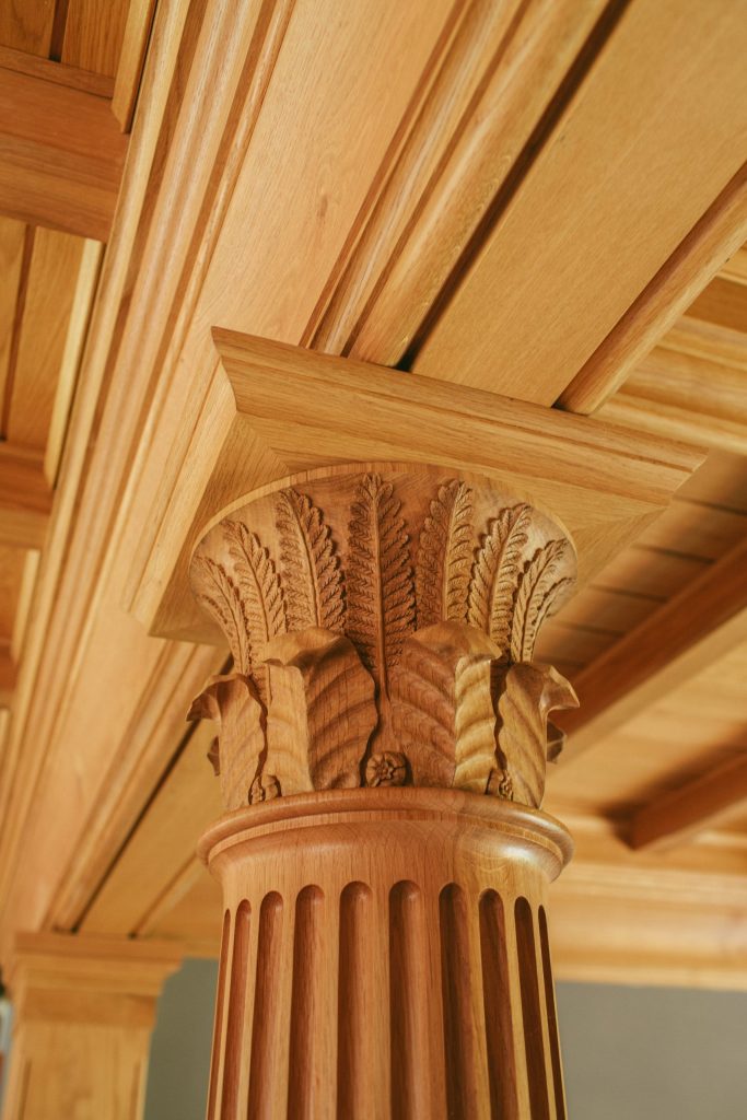
Oak carved column capital
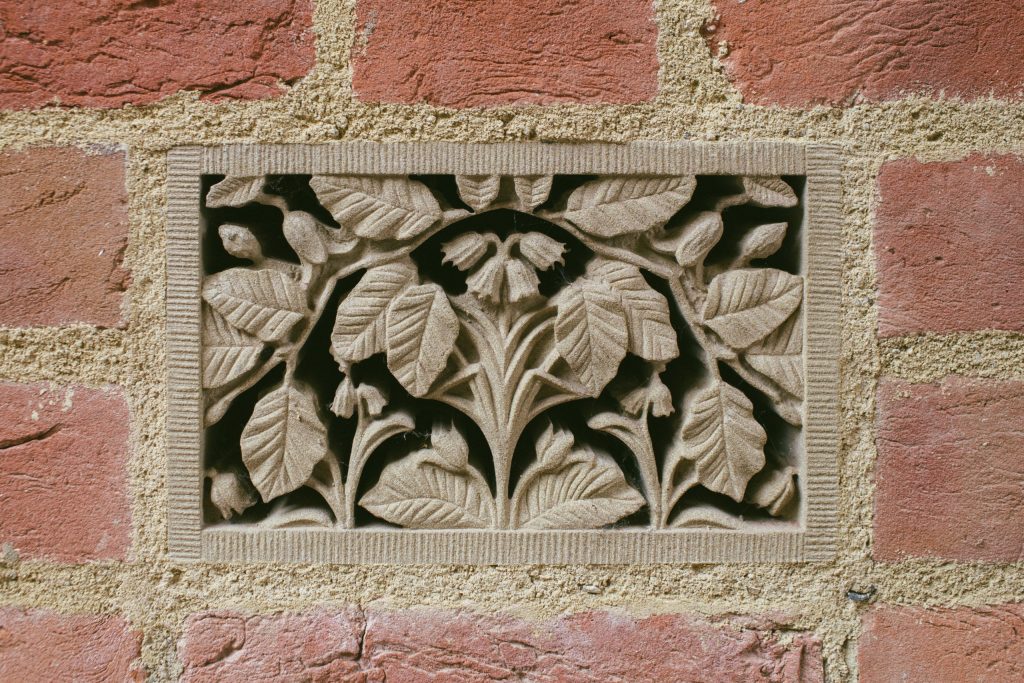
Carved stone air bricks
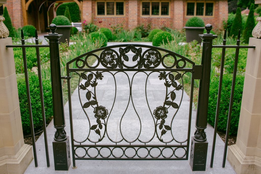
Garden Gate
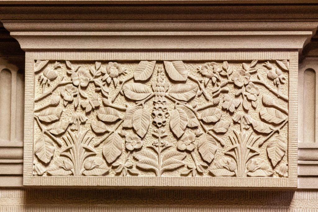
Fireplace keystone
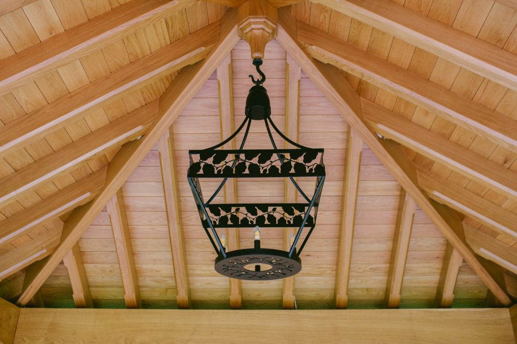
Pavillion Chandelier
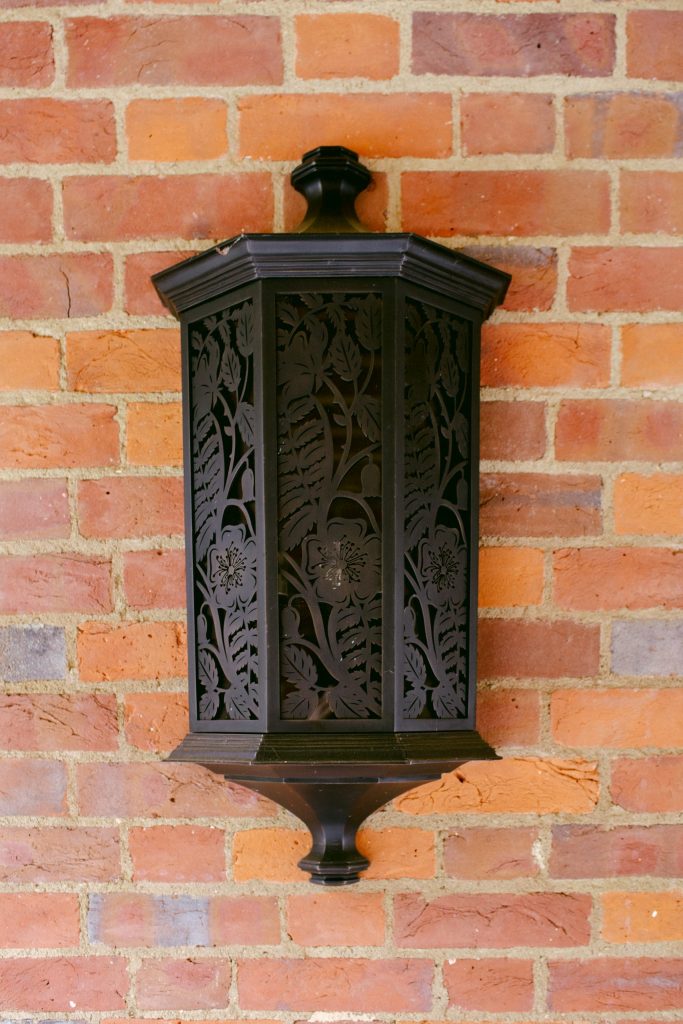
Outdoor wall lanterns
To view more images of these items and many more of our individually designed bespoke items visit the Curiosities Emporium.
For this house design, my team and I quickly discovered that the surrounding woodland was the heart of the property and provided the magic spark that was needed to create something that we hoped would be special. Much of my inspiration came from walking through the woodland on a spring day, when the dense mat of bluebells were in full bloom. The massive beech trees have grown taller rather than broad as they were originally intended to be used for coppicing and so were planted to grow as straight as possible. The result is a mixed woodland of beech, dogwood, bluebell and oak. I wanted to celebrate this idyllic setting, within the designs for the house, with features that would otherwise be hidden or less looked for, much as you would find in a woodland. What started as the odd detail here and there, like an elaborate air vent or metal detail, soon turned into more ambitious works. Whilst Jess and Scott in my office focused on the complex design of the extensions and how they were going to be constructed, Lydia and I set about developing the ‘motif’ for the site that would eventually inform and be reflected in the architecture.
Key to this was the informal nature of the designs. We did not want to create a Morrisesque pattern or an overtly classical aesthetic that would conform to the normal moulding patterns used in classical architecture. Despite my adherence to the rules of classicism and my own training, I wanted to develop our versions of these mouldings and motifs, informed by not only the classical language of architecture and the Arts and Crafts movement, but also by the immediate site around us. I was also keen to develop our current knowledge of technology in order to help us achieve these goals.
‘Some of my favourite designs have been created out of conflict with one of my designers….’
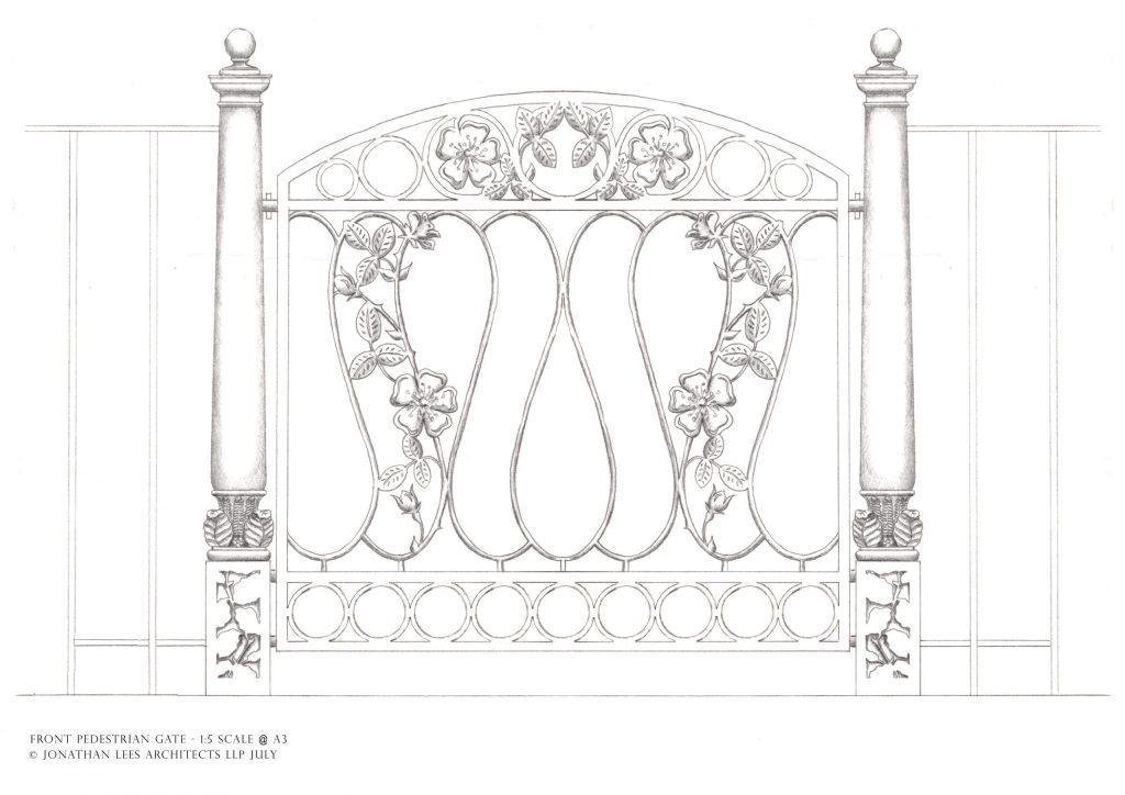
Pencil sketch design for the garden gate
Some of my favourite designs have been created out of conflict with one of my designers, who will often vocally express a distaste or joy at a design, but I always encourage honesty and am never left scorned if someone disagrees with me.Whilst working with Jess, Scott and Andrea on the main house delivered detail and accuracy that I was proud of, Lydia and I ventured to our limits, at that time, on the creative designs, ranging from floral patterns to stained glass windows that have enhanced the character and setting of the house beyond anything else seen today.
Back to the house…..
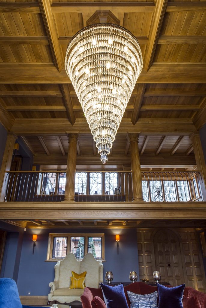
Main hall looking up to gallery
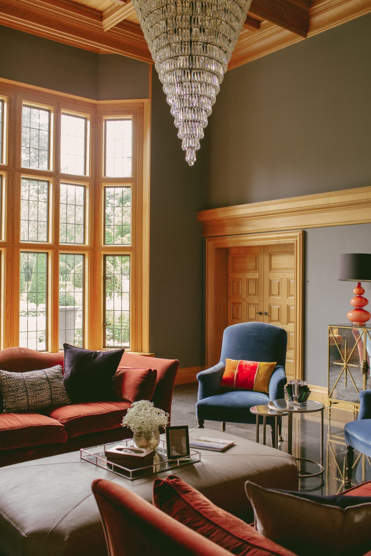
Main hall towards south bay window
‘…the most challenging of the spaces was the main hall.’
Part 16 – The main hall and gallery
Perhaps the most challenging of the spaces was the main hall. I wanted to put a lot more detail into the design than the previous Architect had done. The client, as with all of the house, gave us a free reign to come up with something creative.
What I knew was that I wanted the main hall back to its former glory, an idea shared by the client. I also wanted to reinstate the minstrels gallery on the north side of the main hall, as it would now be lit by our full width gallery and south bay window. With the help of my team, who are adept at spatial planning and working on complex internal arrangements, we soon developed a design that created the spaces, light and environments that we knew would work with the architecture. It was obvious that the main hall would be dramatic, with its full height, south facing window, but even with this huge area of natural light, the back of the room would still feel dimly lit, so the introduction of windows at ground floor level and the full width gallery on the first floor provided the soft, natural light that north facing windows provide.
The use of the boot room as the daily entrance meant that we could have a bit more fun with the front door as it would be used less, and on more formal occasions. Instead of an enclosed porch, we designed an arched headed, multipaneled door that sat inside a panelled frame and covered the north wall of the porch from the inside. The ceiling of the minstrel gallery, constructed of four-inch square oak joists with chamfered edges, passes into the porch and is framed either side by the splayed reveals of the stone slot windows to the flanking walls of the entrance. Above this, a seat was constructed in oak, with cushions designed by Anne Haimes to create a peaceful place for reflection and calm on what would otherwise be a thoroughfare to get from one wing of the house to the other.
The seat to the gallery matches the detail of another seat to the south bay window which covers a series of radiators and prevents condensation from forming.
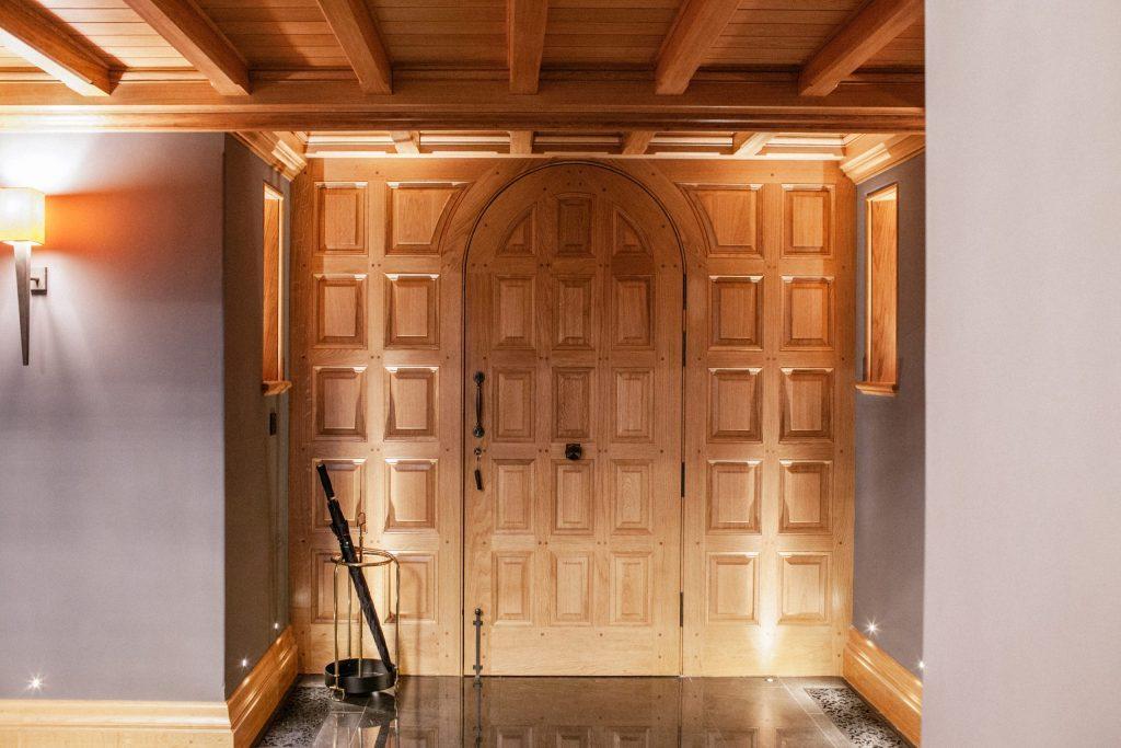
Front door and panelling
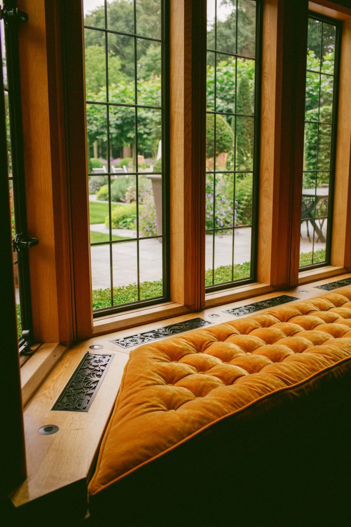
South bay window seat
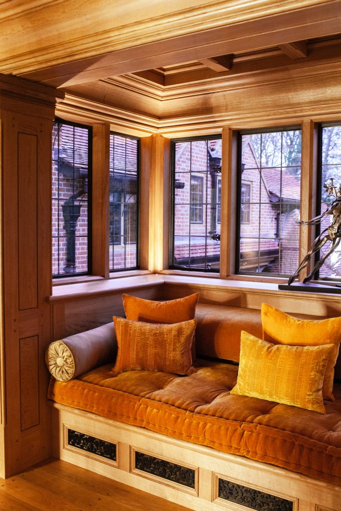
Porch seat over front door
The ceiling in the main hall is an example of the client having faith in our ability to develop a complex design and in our faith that the joiner, in this case Houghtons of York, could deliver. The complex system of running mouldings and intersecting beams of varying depth presented a challenge that was executed with exceptional skill. We embellished the minstrels gallery with a pair of Corinthian columns to our own invention, developed from the columns of the Temple of the Tower of the Winds but using beech leaves and fern fronds in replacement of the lotus and acanthus leaves usually associated with the neo-classical examples. I also altered the proportions to favour a Doric column, being more broad in character and able to the carry the deep, heavy beams over. The column shafts, constructed in oak by the age-old method of coopering, were also fluted.
The other features to note in the main hall is the ‘witch’s hat’ to the centre of the ceiling that supports the chandelier and the fireplace. The witch’s hat was designed to provide a central focus and to provide a place to hang the chandelier by way of an iron hook fixed to a metal rod that passes up through the ceiling to a metal plate spreading the weight of the chandelier over a steel substructure.
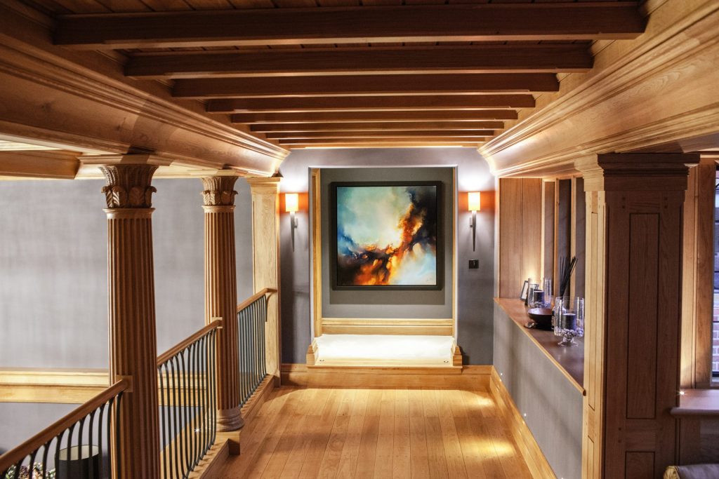
Minstrel’s gallery above main hall
Part 17 – The main hall fireplace
The main fireplace was something that came to me one evening after I had agreed with the client that we would design the fireplaces to the main hall, sitting room and orangery from scratch, rather than buy reproductions. I included a deep architrave bolection mould that we also used on the exterior door surrounds to the orangery, with a cambered head creating a spandrel between the mantel passing over. Outside of the deep architrave are a pair of engaged Doric columns, miniatures of those used on the orangery frontis. Over this, I embellished the entablature fluting that terminates with a curved top. The rhythm of these deeply cut flutes would be highlighted by the sun beaming through the south bay window during the day, enhancing the features and providing a depth to the design that cannot be recreated with artificial light. At night, the depth of the mouldings is reversed by the soft glow of the fire illuminating the projecting surfaces. The enlarged cornice, with its elongated cyma moulding at the end, creates a deep mantel casting more shadow and opportunity for interest. The inside of the opening is decorated with simple, coke stained purple bricks laid in a herringbone fashion with black mortar, set over an Irish Blue limestone hearth.
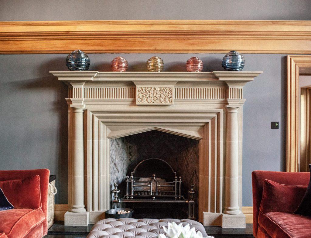
Main hall fireplace
For more pictures and information on the fireplace see it in the Curiosities Emporium here.
Part 18 – The kitchen and orangery
The floor throughout the ground floor was hotly debated between the client and I, and eventually we settled on Irish Blue Kilkenny limestone, one of the most beautiful stones to be found be found in the British Isles, or anywhere in the world. The Jurassic limestone is hard as brass, and when polished it has a glass like quality that makes the many thousands of white shells embedded in the stone come alive.
The other interior space that required a high level of attention to detail was the kitchen/orangery. By adding the extension, we more than doubled the size of the existing kitchen. We also had the challenge of concealing a heavy steel beam on the line of the main structural wall to the house on its east elevation. Rather than having two separate ceilings, split by this beam, I wanted to create something that flowed across the whole ceiling, giving the impression of one large room, rather than a split space of kitchen in one area, and sitting room in another. This was done by creating a shallow vaulted detail with a bead moulding to the underside that wraps around each vault, allowing it to flow into the cornice mouldings at the junctions of the wall. What was essentially a relatively simple initial concept, presented numerous challenges during the drawing phases. Each were ironed out by Jess from my team and expertly developed and installed by the team at Ornate Interiors, who installed all of the fibrous plaster in the building.
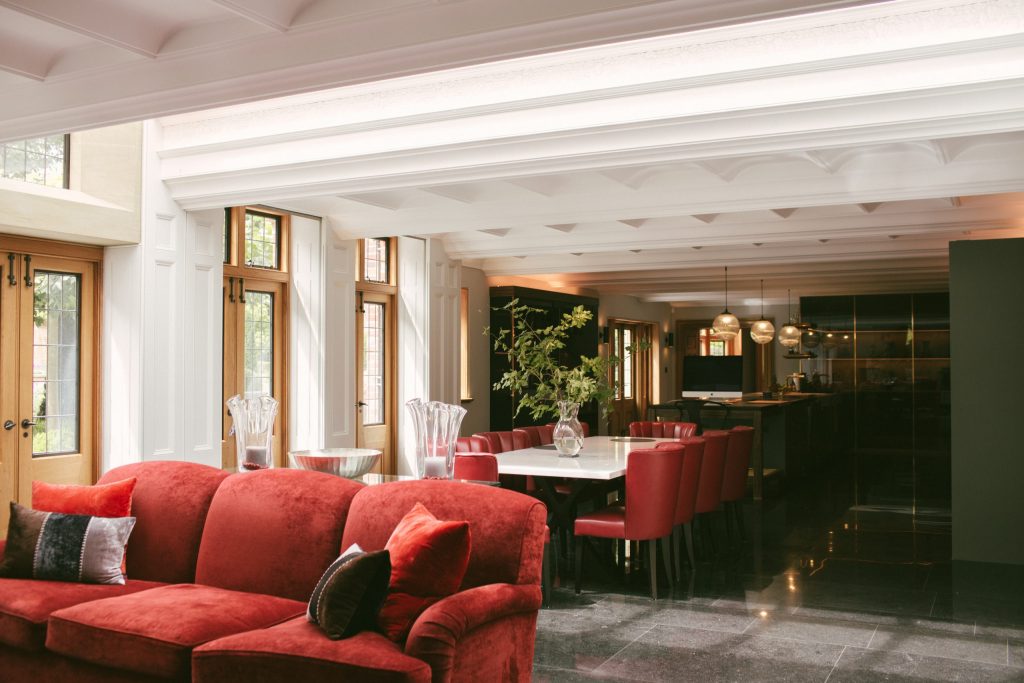
View to the kitchen from the orangery
‘…a whale’s ribcage.’
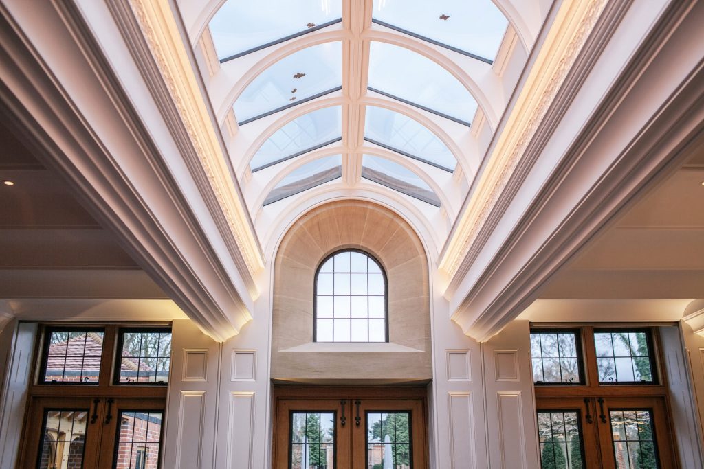
The orangery roof light
The ceiling detail in the orangery includes an elaborate upstand to a full width rooflight that spans from north to south over its central frontis facing the garden. I refer to this effect as a whale’s rib cage, as the curved spars, with their beaded undersides to match the vault profile, resembles one greatly. The upstand to the rooflight, which consists of a pair of deep, heavily moulded beams, includes a decorated frieze of beech leaves and bluebells that was designed by Lydia and I and modelled in clay by Ornate Interiors before being cast in section to form the running frieze.
We also had to integrate the pantry unit of the kitchen into the ceiling. The kitchen units, beautifully designed and made by Doig Furniture, include glass panels that fit in a channel in the floor and reach up to the underside of the beam casing, where they are fixed into the space of the 20mm bead that runs under the vault. This all had to be very precise, and the result was worth the effort.
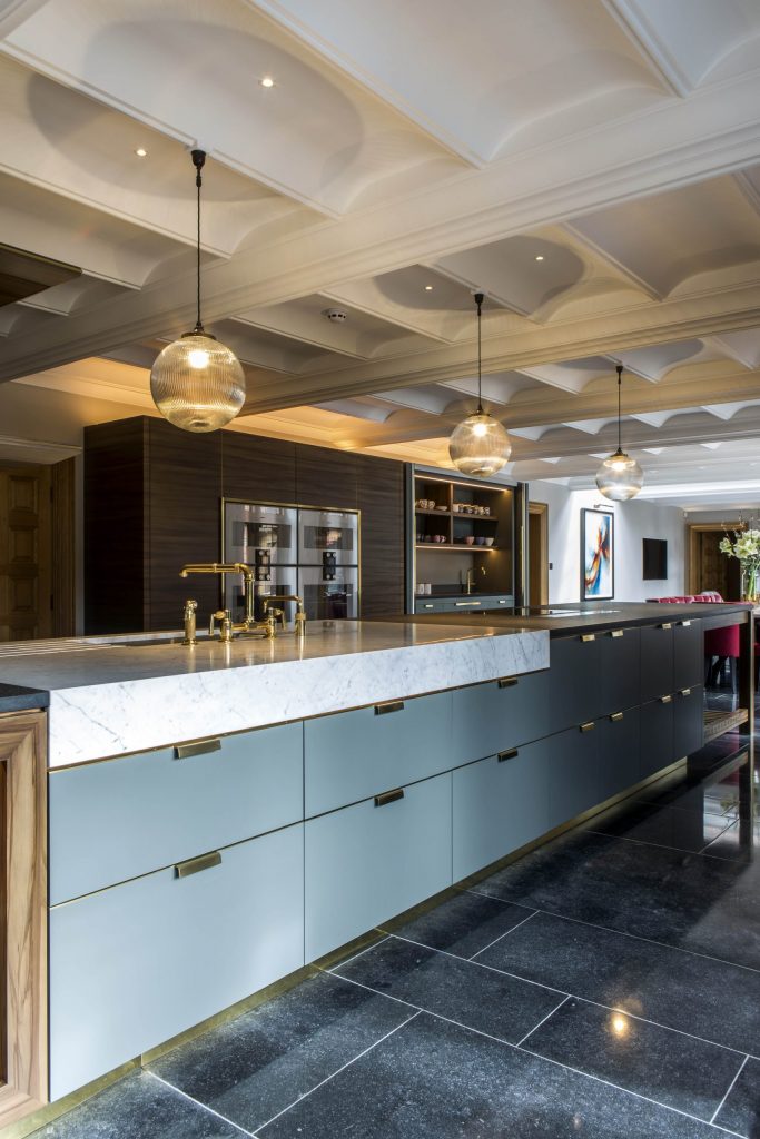
The Kitchen
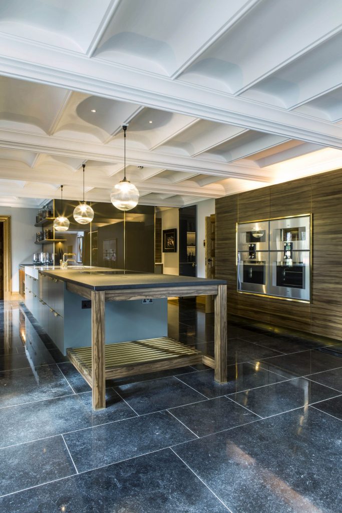
The internal elevation of the orangery is decorated with timber panelling backing onto the piers of the south elevation which also needed to integrate with the ceiling mouldings. Along with this, we developed a concealed detail that allowed for an electronically operated blind to pass down a channel on the inner edge of the front face of the panels. The motors for the blinds were hidden behind a timber moulding that can be removed for servicing or replacement, with the blind itself completely concealed until it is drawn down. Shutters were considered, but it was felt they were too harsh and hard in a room that already had the hard surfaces of the plaster ceiling and stone floor, whereas the blinds would provide an acoustic cushion when closed.
Part 19 – The feature staircase
Although the main hall is one room, it is linked directly to the stairwell on its north – eastern corner. The stairwell itself is not huge, and room needed to be provided in order to be able to pass to the side of the stairs to reach what was going to become the cinema room in the east wing of the house. After much deliberation with the client, we settled on a design for a stone, cantilevered stair that sits on its own supporting wall (so it is not truly cantilevering but is still embedded in the wall). The steps were worked from solid sandstone slabs with bullnose and cavetto moulding to the fronts and spandrel brackets to the ends expressed with our now common tooled margin and scabbled field. This brought a different dynamic to the space as it increased the depth and richness of the detail in artificial light.
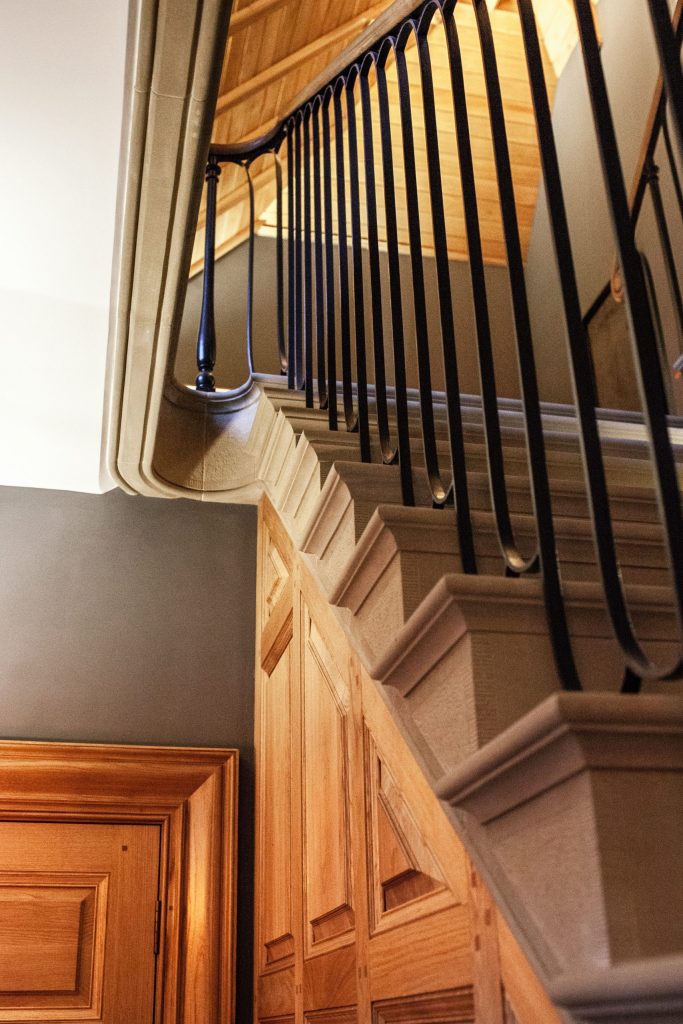
The Staircase
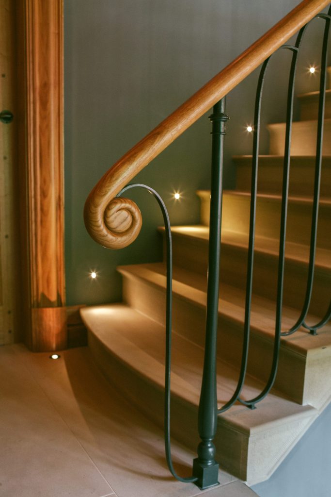
Oak handrail detail
‘This was an extremely complex series of spaces that required every ounce of our spatial planning brainpower…..’
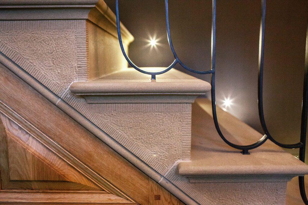
The detail in the staircase
At the top of the stairs, a tight curve in the soffit leads to a stone platform and passes back around to the minstrels gallery which is reached by a further 3 stone steps dropping down below the bulkhead of the sloping roof. This was an extremely complex series of spaces that required every ounce of our spatial planning brainpower and used multiple drawings and forms of software to help us to model how the spaces would work and what our headroom was going to be. Jess and I worked for many hours on these designs to come to the resolved conclusion.
With the stone staircases decided we focused our attention on the balustrading. In truth, it all came together in one design, and top of my list of things to do here was to develop the handrails using a pattern that Sir John Soane had first used in his London houses. I had been looking for an opportunity to develop the detail for a long while, and when drawing the design of this staircase it presented a perfect case.
We used a simple metal top rail to link the ‘S’ design, and I designed a ‘tulip’ flute as the knewel, being almost as slender as the flat ‘S’, the whole ensemble was quite delicate. The balusters design flipped when it met the knewels, meaning that we could have fun with the way in which the design caught the light by changing the direction of the pattern over the stone gallery and between the columns of the minstrels gallery. There was no baserail, instead we took a traditional approach of using cork and molten lead to fix each and every one of the balusters into the stone. The handrail was a simple, elegant sweeping oak round, with a hand carved snail shell at the bottom of each flight. Once again, we were blessed with the skill and talent of knowledgeable trades, in this case Ironart of Bath, who produced the beautiful craftsmanship that brought our drawings to life, along with Houghtons who carved the handrail sections.
Part 20 – Re-thinking the roof space
Following a number of design iterations of the area and following progress of the clear out and reconstruction of the main roof space, the client had the idea that the entire volume of the roofspace should be redesigned so that it included a master suite. We had previously designed a guest bedroom, along with a small ensuite and dressing room up there, but on completion of the structural work it became clear that the space was quite special. By introducing a relatively minor change of including two steel purlins to the main roof, we were able to open up the whole of the central mass. Over the west wing we designed a large en-suite that included a walk-in shower and occupied a space previously considered as a store or bunk-room for the kids, and over the east wing, via a couple of steps passing through the main spine wall, the master dressing room would sit in the apex of the roof. The change, which was significant, came about purely because the client had the ambition that he wanted to get as much as possible out of the space.
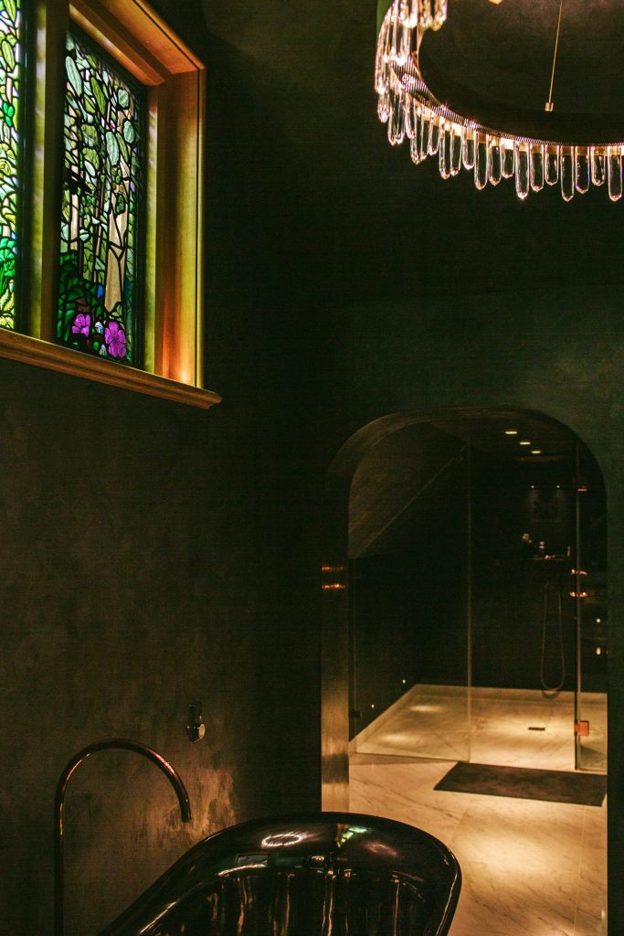
The master en-suite with bespoke stained glass window
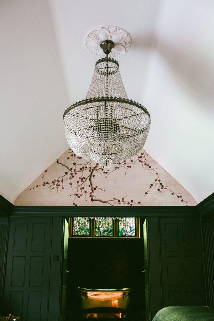
Master bedroom with bespoke ceiling rose
The result of using the roof-space has enabled us to open out the ceiling from the first floor stairwell to the second floor access into the new master suite. We continued the stone staircase up to the access of the master suite and created a landing. But how to deal with the ceiling…
Part 21 – The stairwell ceiling
From memory, the idea for the hammerbeam ceiling to the stairwell came fairly instantly. I wanted the space to link with the main hall but be remarkably different at the same time, as the ceiling was sloped rather than the flat expanse of the main hall. You also needed to be able to walk right up to the top of the ceiling to gain access to the master suite, so the detailing had to be impeccable. I had an idea for hammer beams, a vernacular detail used often in the great barns of the 16th to 18th century. Down-stand posts support a bladed tie preventing the spread of a long, elegant rafters which pass to the eaves on the north elevation. The posts themselves are panelled with a bead to the edges, terminating in a stop chamfer and an angled boss to the base. The rafters have a triple reed moulding to their undersides which help to create an illusion of loftiness to the space as they draw the eye upwards over the horizontal oak sarking board. The view when exiting the master suite is one of rhythmic arches that bring the ceiling detail to arms length. As with the main hall, this work was expertly executed by Houghtons of York, with no room for error as every cut and joint was on show.
‘The view when leaving the master suite is one of rhythmic arches……’
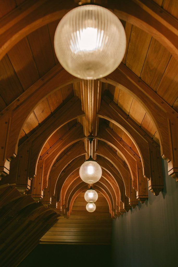
Oak ceiling arches
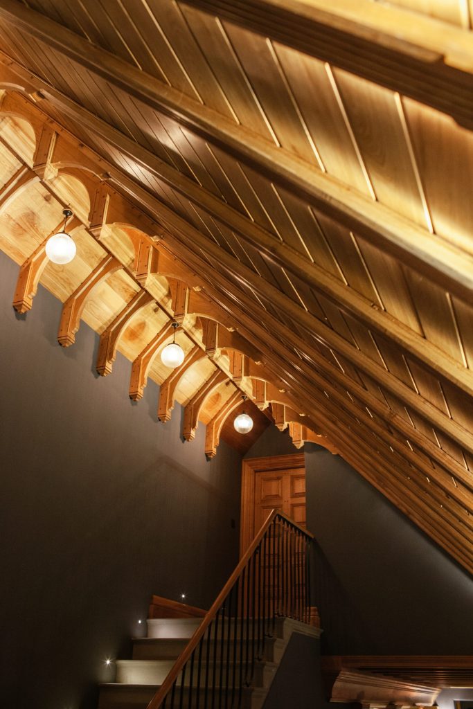
Hammerbeam ceiling
Part 22 – The family bathroom
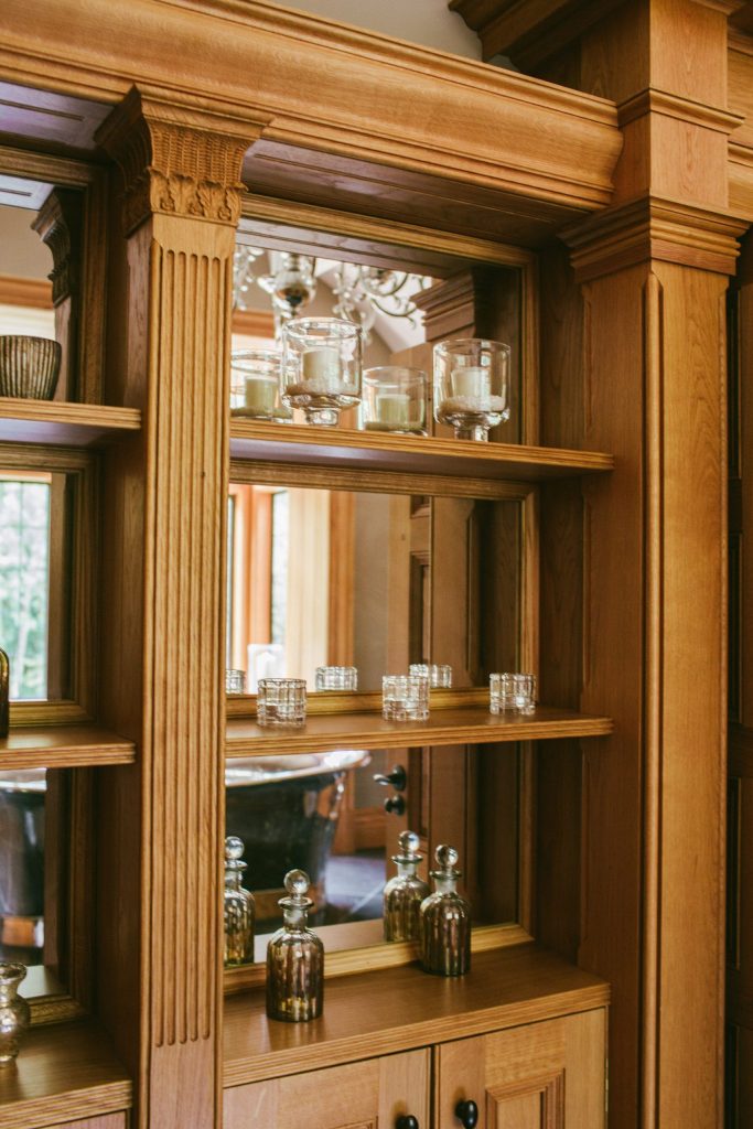
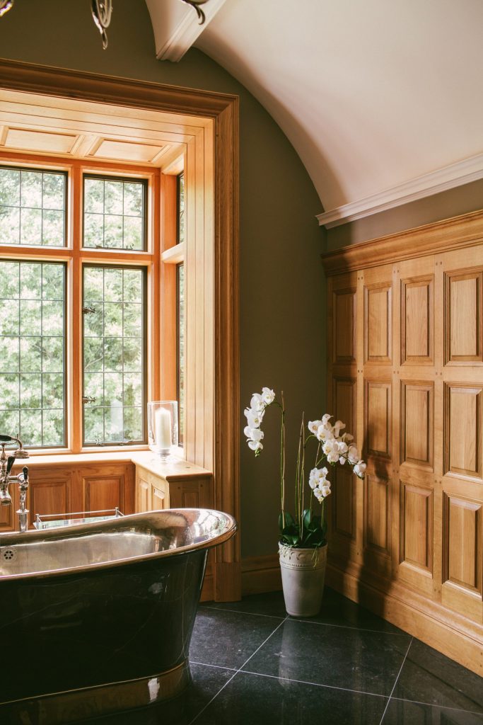
One of the other rooms where we were let loose and able to express our creativity was the family bathroom. Located in the new east wing, the room has a full height bay window to the north elevation. We opened up the roof with a steel frame, creating a room that was taller than it was long or broad. It was perfect for a double vaulted plaster ceiling that now spans from north to south with a moulding at the apex adapted to enable a chandelier to be hung in the tall space over the bath. The vaults were made in large sections and installed onto an elaborate, and unfortunately covered, substructure.
We designed all of the panelling and cabinetry in the room, which consisted of raised and fielded panels with a tall skirting and flush panels behind the sinks and high level cisterns. As with many of the other details in the house, Jess and Scott developed the working drawings with me and Lydia helped with the development of the design of the ornately carved capitals to the cabinets, all of which were constructed and installed beautifully by Advance Joinery. I was worried that the room would become a showpiece and that the nickel plated bath in the centre of room, set over the diamond pattern, polished Kilkenny limestone would not be used for fear of splashing water everywhere. I was delighted to find that their children are regular users of the bath and the room is used on a daily basis.
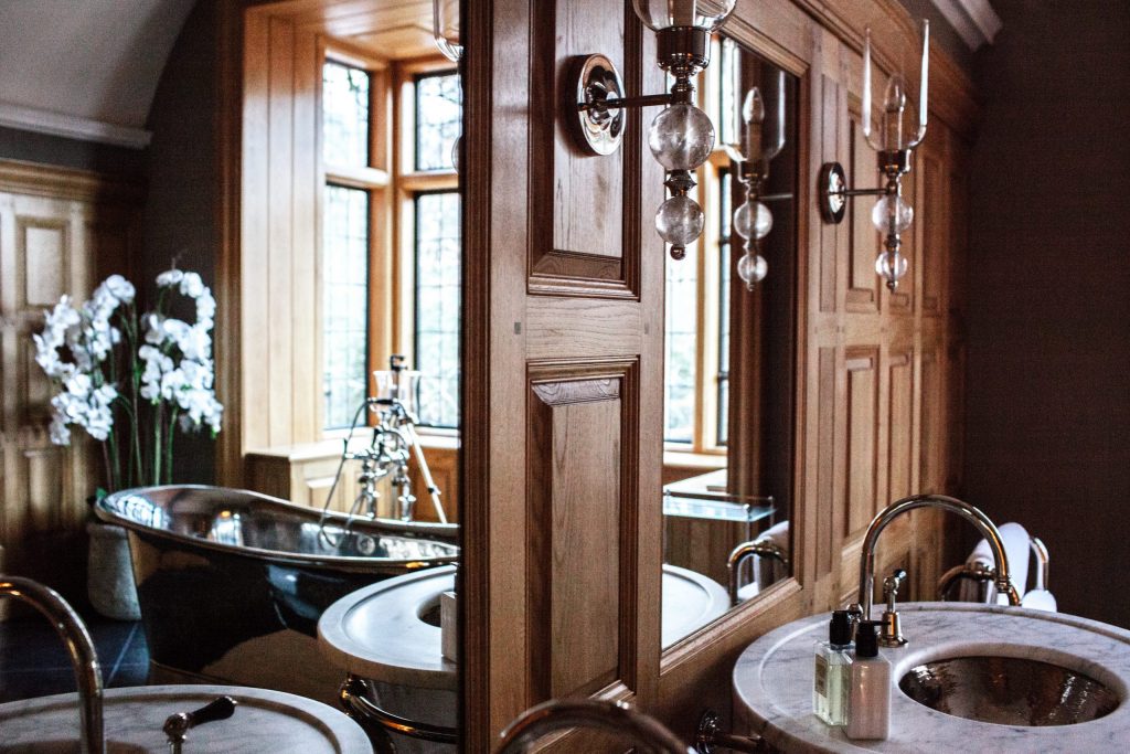
Panelling in the bathroom
Vaulted ceiling and panelling
Oak and glass cabinetry
There are plenty of other areas in the house that I have not mentioned here that deserve a writing of their own to reflect the thought, consideration and craftsmanship in their construction (have a browse through the rest of the writings to find more on this project), but I shall finish off this musing with a thanks to everyone involved in the project. It was not created through the vision of one person, it was a team effort that involved many levels of trade from labourers through to highly skilled craftsmen and women, which I am pleased has been recognised by the three national awards that it has won so far.
I would like to thank the client, whose vision, ambition and trust in us allowed us to create this house. I would also like to thank my small, dedicated and extremely talented team of designers and technicians, without who my own creations could not be built or improved upon. To Scott and Jess for their ability to produce the most outstanding working drawings and for patiently working with me through tricky, almost impossible designs, to Andrea for her avid attention to detail, to Bex for her team support and to Lydia for her extraordinary creativity and passion for design.
Finally, to give thanks to the trades who helped to build this house, from those that won the awards with us, to those that deserve an award themselves, to Fusion Brickwork, Gelder Joinery, Ketton Stone, Houghtons of York, Advance Joinery, Martin Wyatt Joinery, Ironart of Bath, British Spirals and Castings, Style Interiors, Glenhurst, Kipps Webb Electrical, Ornate Interiors, Vale Windows, Top Mark roofing and to the experience of our dedicated carpenters at GT Carpentry. Also, thanks to Anne Haimes Interiors and Doig Furniture for their support and attention to detail and to my long standing colleague Paul Hobson, our Structural Engineer, without whom, our buildings would fall.
Finally, I would like to thank Glen Martin, the site agent and construction manager without whom none of this would have been built.
As I have said, it was a team effort.
Return to the Writings Library for more essays and Project Profiles
info@jonathanleesarchitects.co.uk
01173 790079
